

The essence of building a conversion-focused landing page is this: you choose a single goal, and every element on the page serves only that goal. You write a clear headline that directly mirrors the promise in your ad, a hero section that communicates your value proposition within seconds, social proof that builds trust, content that addresses objections one by one, and a form as short as possible; you strip out every distraction — navigation menus, sidebar links, secondary offers. What remains is a single call to action (CTA), and the visitor has two choices: accept the offer or leave. In this guide, we walk through every step of building a high-converting landing page from scratch for businesses that are spending ad budget but not seeing conversions.
The situation we encounter most often with businesses that come to us looks like this: significant budget is allocated to Google Ads or Meta ads, click costs are reasonable, traffic flows in regularly — yet sales or form submissions are next to nothing. When we open the account and take a look, we find that the problem is usually not in the ads but in the page where the traffic is being sent. Clicks are landing on the homepage or a cluttered product listing; the visitor doesn't know what to do and leaves within seconds. Yet every ad click is a moment of attention bought with real money, and if there's no dedicated page to meet that moment, a large portion of the budget is wasted right from the start.
What Is a Landing Page, and How Does It Differ from a Regular Web Page?
A landing page is a standalone page designed to direct visitors arriving from a specific source — an ad, an email, or social media — toward a single action. Your homepage tries to do dozens of things at once: it tells the brand story, lists products, links to blog posts, and points to corporate pages. A landing page does exactly one thing: it presents the offer and asks for a decision.
The concept that best illustrates this difference is attention ratio: the ratio of clickable elements on the page to the targeted conversion action. On a typical homepage this ratio can be 40:1 or even 50:1; on a well-built landing page the ideal ratio is 1:1. That means the only meaningful thing the visitor can click is the conversion button. Every extra link is a small invitation that says "you can leave from here too."
| Feature | Regular web page | Landing page |
|---|---|---|
| Goal | Multiple (branding, navigation, information) | Single (form, inquiry, purchase) |
| Navigation | Full menu + footer links | None or minimized |
| CTA | Various different actions | Single action, repeated throughout the page |
| Traffic source | Every channel, every intent | Specific campaign, specific intent |
| Success metric | General engagement | Conversion rate |
This is why the "let's send the ad to the homepage — the site looks good anyway" approach almost always ends in disappointment. How you build your site as a whole is a separate decision — we covered that in Template Site or Custom Software?; this article is about the dedicated page locked to a single goal, namely the landing page.
Before You Start: One Goal, a Clear Offer, One CTA
A good landing page begins on paper, not in a design tool. Before writing a single line on the page, you need clear answers to these three questions:
- What is the conversion goal? Form submission, phone call, WhatsApp message, appointment, pre-order, purchase… Choose one goal for one page. The moment you say "let them fill the form AND download the catalog," conversions don't split in two — most of the time both drop.
- What is the offer and why is it compelling? "Get in touch with us" is not an offer. Free discovery call, first-month discount, free shipping, 30-day unconditional return, a concrete delivery date… The visitor needs a tangible reason to fill out the form right now.
- Who exactly is the visitor and what intent are they arriving with? Someone searching "corporate website prices" on Google and someone who tapped your video on Instagram aren't looking for the same thing on the same page. The traffic source determines the tone and content order of the page.
The CTA copy should also be defined at this stage. "Submit" is the weakest button text; copy that states the outcome of the action works better: "Schedule a Free Discovery Call," "Get My Quote," "Watch the Demo." In the accounts we manage, making button text outcome-focused has consistently been one of the cheapest changes to produce a measurable difference.
A note specific to the Turkish market: on the services and B2B side, WhatsApp can be a stronger conversion channel than a classic form. You can incorporate this without conflicting with the single-CTA principle like this: choose either the form or WhatsApp as your primary CTA, and let the other remain as a visually quieter secondary option. As long as both doors lead to the same goal (starting a conversation), attention isn't divided; the real problem is when competing goals like "fill out the form" and "browse our products" share the same page.
Anatomy of a Conversion-Focused Landing Page
Nearly every high-converting page shares the same skeleton. This skeleton is not a template — it's a persuasion flow: as the visitor scrolls down, they first see the promise, then the proof, then the details, and finally the moment of decision. Let's build this flow section by section.
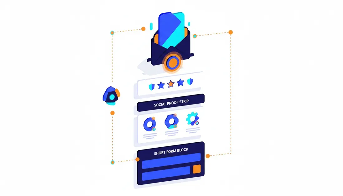
1. Headline and value proposition
The headline is the most valuable real estate on the page; every visitor reads the headline, and the share who read on drops with each scroll. A good landing page headline does three things at once: it repeats the promise from the ad, states the outcome (the benefit), and makes clear who it's for.
- Weak: "Quality Service, Affordable Price" — speaks to everyone, resonates with no one.
- Good: "Your E-Commerce Site Live in 21 Days" — concrete result + clear timeline.
- Good: "The Website That Brings Appointments to Your Clinic" — audience + benefit in one sentence.
The subheadline lightens the headline's load: it answers the "how" in one or two sentences, clarifies scope, and if you have a strong proof point (number of clients, years of experience), pins it here.
2. Hero section
The hero section is where the headline, subheadline, visual, and primary CTA meet in the above-the-fold area visible without scrolling. The five-second test is applied here: if someone completely unfamiliar with the page can't answer "what's being sold, what's the benefit for me, what am I supposed to do" in five seconds, the section isn't doing its job. Use real product shots, real screenshots, or actual results rather than representative stock photos; a short, muted, auto-playing video is also a strong alternative. Avoid rotating sliders: they distract attention and leave your message to chance.
3. Social proof
People trust others' experiences, not claims. The forms of social proof that work on landing pages are:
- Customer testimonials: with a name, company, and ideally a photo. Choose testimonials that tell a story of results, not just "we were very happy": what problem existed, what changed.
- Case studies and numbers: "We reduced Brand X's return rate by this much" — one concrete story is more persuasive than twenty anonymous compliments.
- Logo strip: brands you've worked with, platforms you use, organizations you belong to.
- Platform ratings: third-party evaluations like Google Business ratings or marketplace store ratings.
A word of caution: fake reviews are both an ethical and a legal risk; in Turkey, the Advertising Board (Reklam Kurulu) enforces sanctions in this area. If you don't have many references yet, stay honest: one detailed pilot case study is always more powerful than a wall of fabricated reviews. On e-commerce pages, secure payment logos (iyzico, PayTR, bank virtual POS (payment gateway)), SSL, and clear return conditions are also trust signals.
4. Benefit–feature balance
A feature is what the product is; a benefit is what it changes in the customer's life. Most pages list features and leave the visitor to make the translation themselves. The practical rule: next to every feature you write, add the answer to the question "so what?"
- "24/7 technical support" → meaning "you won't be alone if the site goes down on the night of a campaign."
- "Mobile-friendly design" → meaning "the majority of your customers can place orders comfortably from their phone too."
- "Virtual POS (payment gateway) integration" → meaning "with card, installment, and wire transfer options, no sale slips away at checkout."
Order matters too: the strongest benefit goes at the top. A significant share of visitors will never scroll to the bottom of the page; don't save your best card for the finale.
5. Objection handling
Before closing the page, the visitor is turning over three to five objections in their head: "It's expensive," "It's not for me," "Is it trustworthy?," "I'll look at it later." A good landing page answers these objections before the visitor voices them:
- Risk reducers: return guarantee, free trial, cancel anytime, free discovery session.
- Process clarity: a "how it works in 3 steps" block — knowing what happens after the form reduces anxiety.
- Scope honesty: "Who it's right for, who it's not" builds trust and reduces unqualified leads.
- Mini FAQ block: short answers to the most common questions — pricing framework, timeline, delivery, and VAT/GDPR matters.
For the "I'll look at it later" objection, use honest urgency: a real capacity limit, a real campaign end date. Fake countdown timers that reset on every page refresh may get clicks in the short term but destroy trust in the long run.
6. Form design
The form is the final step and most sensitive point of conversion. The core principle: every extra field is friction. Every question you ask costs you a portion of visitors who give up; if a field is never actually used in the sales process, remove it from the form.
- For most services, name + phone number (+ email if needed) is sufficient. In B2B, a qualifying question that improves lead quality (e.g., monthly ad budget range) can be added — but add it knowing there's a cost.
- If the number of questions is genuinely high, use a multi-step form: easy, non-committal questions first; name and phone number at the very end. A user who has started tends to finish.
- On the phone field, open the numeric keyboard on mobile; show format errors beside the field immediately rather than at submission time.
- Make button copy outcome-focused again; a short assurance just below the form like "your information will not be shared with third parties" works well.
The data protection side is a natural part of marketing in Turkey: if you're collecting personal data via the form, a link to the disclosure text (aydınlatma metni) must be present; if you intend to send marketing messages via SMS/email, a separate, unchecked by default explicit consent checkbox is required (commercial electronic message consent is also tied to the IYS system). This is not just a legal requirement — it's also a visible trust signal.
These six sections create a seamless, top-to-bottom persuasion flow on a single page. If you'd like them professionally designed for your brand identity and target audience, you can take a look at the scope of our Web and Mobile UI/UX Design service.
Mobile Experience and Speed: The Hidden Conversion Killers
In the accounts we manage, the vast majority of ad clicks come from mobile; yet most landing pages are still designed on desktop and "adapted" for mobile. The right approach is the exact opposite: build the page to work flawlessly on a mobile screen first, then derive the desktop version from that.
- Thumb zone: the primary CTA should be easily reachable with one hand and thumb. A sticky CTA bar anchored to the bottom of the screen on mobile keeps the moment of decision always one tap away while scrolling.
- Touch targets: buttons and form fields should be large enough to tap comfortably with a finger; links crammed side by side lead to wrong taps, which lead to exits.
- Readability: shrinking text and cropped hero images on mobile are among the most common problems we see. Always open the page on your own phone over a real mobile connection and test it before going live.
- Avoid pop-ups: presenting a visitor arriving from an ad with a second offer breaks the attention ratio and turns into a battle to find the close button on mobile.
Speed is a silent budget drain: the user who clicked an ad is the least tolerant of waiting, and when they hit the back button before the page loads, you've already paid for that click. The industry-accepted practical threshold is for the main content to be visible within a few seconds on mobile. Serving images in WebP format at the right dimensions, compressing video, and removing unused scripts handles most of the work on the majority of pages. Because a landing page is a single page, speed optimization is far easier than for a full site; for measurement and improvement steps, see our PageSpeed Insights guide.
Ad–Page Alignment: Message Match and Quality Score
Thinking of a landing page as something independent from the ad is one of the most expensive mistakes. The visitor clicks through to the page on the strength of a promise and looks for the continuation of that promise on the page. This is called message match: if your ad says "20% off your first order," the page headline should repeat that same discount, ideally in similar wording. A visitor whose expected promise doesn't match what they see on the page feels like they've landed in the wrong place and leaves — silently, without blaming the page.
- Ad headline ↔ page headline: same promise, similar language.
- Ad visual ↔ hero visual: same product, same visual world. If the product in the video they saw on social media differs from the image they encounter on the page, there's a disconnect.
- Variant per campaign/ad group: using the same template but changing only the headline, visual, and opening paragraph based on the search term or creative produces a noticeable difference compared to a single "general" page.
On the Google Ads side there's a direct monetary equivalent: one component of Quality Score is landing page experience. A page that is relevant to the ad, fast, and user-friendly raises the quality score; you pay a lower cost per click for the same ad position. In other words, a good landing page doesn't just increase conversion rate — it also makes traffic cheaper: the budget wins on both ends at once. For the fundamentals of Quality Score and account structure, see our What Is Google Ads and How Does It Work? article, and for sales-side tactics our Google Ads e-commerce sales guide. On the Meta side there's no identical scoring system, but the principle is the same: the alignment between creative and page directly affects ad quality signals and conversion costs; details are in our Meta Ads guide.
The final link is measurement: tag every campaign click URL with UTM parameters so you can see which ad, for which audience, with which page variant is converting. Our GA4 guide is a good starting point for reading this data.
A/B Testing Basics: What, When, and with How Much Traffic?
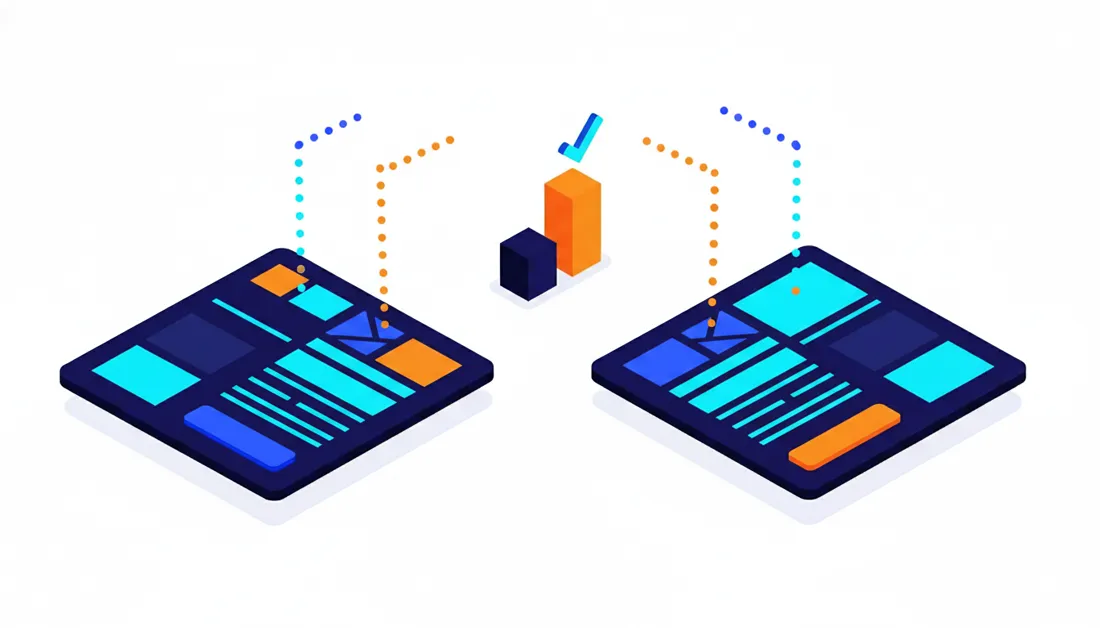
A/B testing is splitting the same traffic between two page variants and measuring which one converts more. It sounds simple; but for SMEs it's one of the topics most often done wrong, because most advice online is written for sites with tens of thousands of visitors per day.
What should you test?
Rank the elements to test by impact potential; the biggest lever is at the top:
- The offer: discount, free trial, or gift? This is the most powerful variable on the page.
- Headline and value proposition: different angles for communicating the same offer.
- Hero image/video: product, result, or a human face?
- Form length and CTA copy.
- Type and placement of social proof.
- Micro details like color and button size — at the bottom of the list, a luxury for high-traffic pages.
How much traffic do you need?
The honest answer: far more than most businesses expect. To reach a statistically reliable result you need roughly hundreds of conversions per variant; if the difference between variants is small, that number grows even larger. On a page that receives 30 form submissions a month, a button-color test might take months — or years — to produce a clear result; by then, seasonal changes, campaign shifts, and ad updates will have already contaminated the data.
The practical rule that follows: test big changes with small traffic. Don't test button color — compare an entirely different headline + offer + structure combination. A big difference shows up even in a small sample; micro differences are only detectable in large samples. If your traffic is too low to even feed a test, postpone A/B testing and invest your energy in message match and the strength of the offer: there's almost always more to win there.
- Test one (but bold) variable at a time; if you change everything at once, you'll never know what worked.
- Run tests in full weekly cycles; Tuesday traffic and Saturday traffic behave differently.
- Don't be fooled by the early-days leader and stop the test prematurely; leadership changes hands often with small samples.
- Be wary of "before/after" comparisons: comparing the old and new pages at different times means seasonal and campaign effects will distort the result. Split traffic simultaneously whenever possible.
- Apply the winner, record what you learned, and move to the next hypothesis. A/B testing is a habit, not a project.
The Most Common Landing Page Mistakes
These are the mistakes that keep showing up when we review our clients' existing pages:
- Sending ads to the homepage. The most common and the most expensive; the visitor can't find the promise and disappears.
- Multiple offers and CTAs. A page that says "let's introduce our services AND capture the form" does both things halfway.
- Leaving the site navigation on the page. Every menu link is a hole leaking paid traffic to pages that don't convert.
- A headline with no promise. A company slogan or a "Welcome" headline wastes the most valuable space on the page.
- Representative stock photos. People in suits shaking hands don't build trust; show the real product, real team, real results.
- Unnecessarily long forms. Every field not used in the sales process silently burns conversions.
- Treating mobile as an afterthought. If the page is "just adequate" on the screen where the majority of traffic arrives, you're leaking budget.
- Going live without measurement. A page launched without a conversion tag and thank-you page is a plane flying blind; you'll never know which ad worked.
- Expecting perfection on the first try. The first version is a hypothesis; it improves as data comes in. Not testing at all is also a decision — a bad one.
- Building the page and forgetting it. Offers become stale, prices change, campaigns end; if the page isn't kept current, message match breaks on its own over time.
Most of these mistakes trace back to a single root cause: the page, the ad account, and the offer being managed in silos. For ways to increase conversion rate beyond the page itself, check the 14 tactics in our CRO guide; the landing page is the most critical piece of that system, but not the only piece.
Before You Go Live: Checklist
The page is ready and the ad budget is waiting. Check off every item on this list before hitting publish:
- The page has a single conversion goal and all CTAs lead to the same action.
- The headline directly mirrors the promise in the ad copy.
- The headline + value proposition + CTA are visible together above the fold, without scrolling.
- The site navigation and any unnecessary external links have been removed.
- At least one real social proof block is present (testimonial, case study, logo, or rating).
- The form asks only for fields that are genuinely needed; mobile keyboard types are correct.
- The privacy/data disclosure link is in place, and a separate marketing consent checkbox (if required) is present.
- Form submission has been tested: the notification email/SMS is arriving and the record is being written to the system.
- A thank-you page or success screen has been set up; the conversion tag (Google Ads/Meta) and GA4 event fire here.
- The page has been opened and walked through end-to-end on a real phone over a mobile connection.
- A speed test has been run; images are compressed and main content is visible within a few seconds.
- All campaign URLs are tagged with UTM parameters.
- Spelling has been checked — this is the cheapest and most unnecessary mistake that undermines trust.
- The page has an owner: who will review the data and make updates, and how often?
If the time or team to do this in-house doesn't exist, getting professional help usually pays for itself by plugging the leak in the ad budget; the realistic ranges in our Web Design Prices 2026 article will be useful when budgeting.
The clearest pattern in our experience: in most accounts with conversion problems, the ads are not "bad" — the bridge between page and ad is broken. What changes the outcome with the same budget is usually not spending more, but meeting traffic with the page it deserves.
If your ads are generating clicks but not sales or form submissions, the problem most likely sits on the page receiving those visitors. At Alis Dijital, our Web and Mobile UI/UX Design service handles conversion-focused landing pages end to end — from concept and copy to design and measurement setup — making the page speak the same language as your ad account. If you're not sure where to start, take a few minutes to complete our free analysis wizard and we'll map out a clear roadmap based on your current situation.

