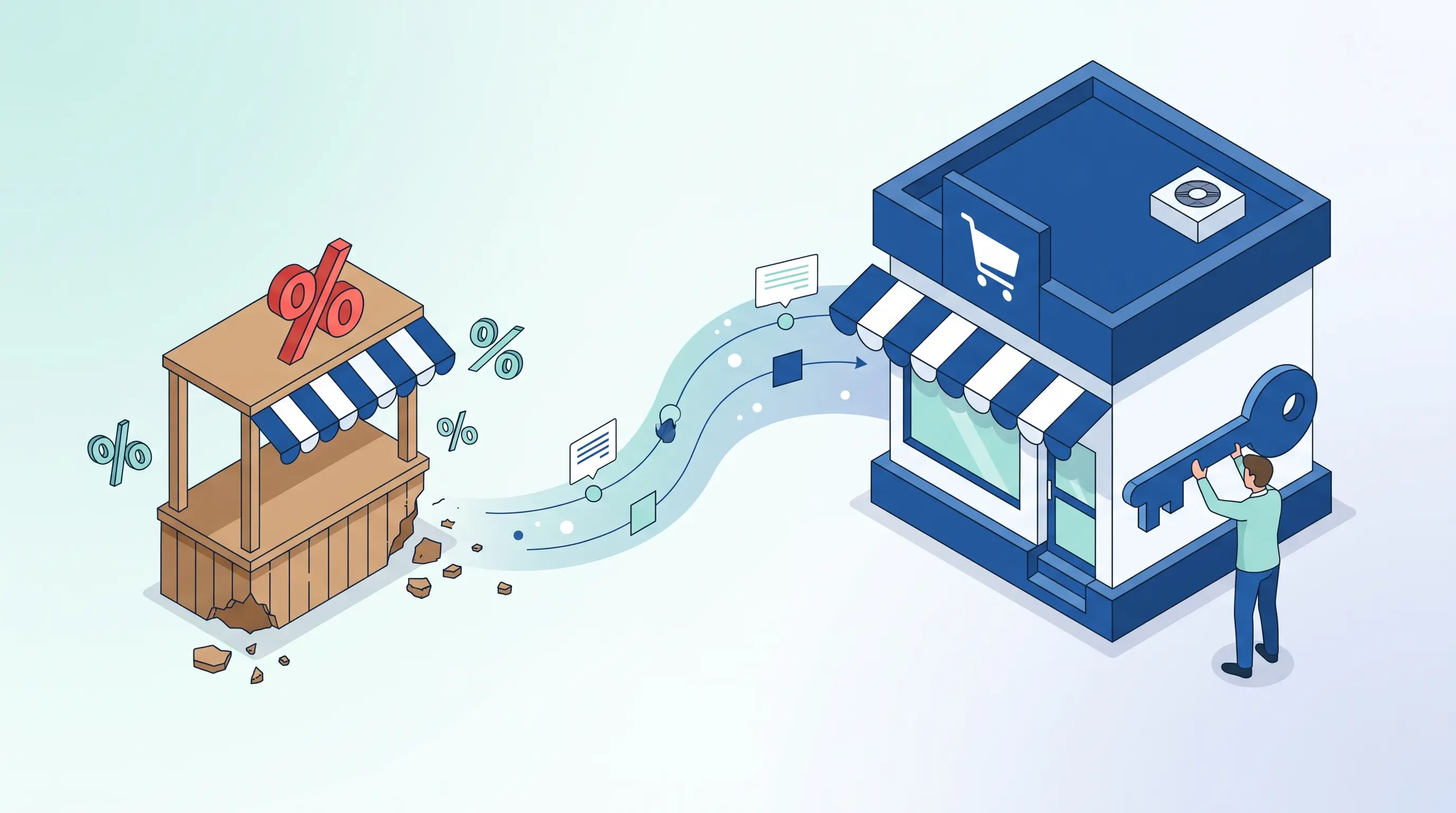
Traffic is flowing, product pages are being browsed, carts are filling up — yet revenue isn't where it should be. Most store owners at this point blame the ads, question the pricing, and launch a new campaign. But the loss most often happens much further down the funnel, practically right in front of the register: the checkout screen.
Industry-wide, the cart abandonment rate hovers around 70%. That means 7 out of every 10 items added to a cart disappear before payment is completed. Even more striking: roughly half of these abandonments have nothing to do with price. By the time a user adds a product to their cart, they've already accepted the price. That means the real reason for giving up isn't the price tag — it's other obstacles that appear at the moment of decision.
This leads to a critical insight: sales are typically lost not during the marketing phase, but during the checkout experience. Your ad has done its job and brought the user to the cart; the real work starts from there. For a broader look at the topic, check out our guide to increasing conversion rates in e-commerce.
The Real Reasons Users Abandon Their Carts
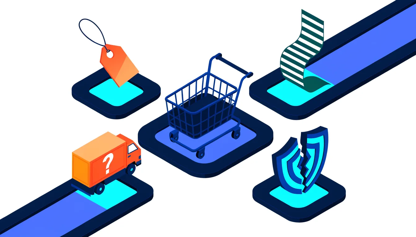
At the moment of decision, a mental scale tips in the user's mind: "Should I complete this, or should I walk away?" There are four classic reasons that add weight to the "walk away" side of the scale:
- Surprise costs. The user puts a product in the cart at one price, then encounters a new figure at checkout — shipping fees, service charges, or additional taxes. Every unexpected extra cost reopens an already-made decision. A user who pauses even once usually doesn't come back.
- A complicated checkout flow. Mandatory account creation, multi-page forms, and distracting messages stretch out the decision-making process. The longer the checkout flow, the higher the likelihood of abandonment — especially on mobile. Mobile users are impatient; even one extra screen can kill the order.
- Unclear delivery and returns. If the answers to "When will it arrive?" and "What do I do if I don't like it?" aren't visible at the moment of payment, the user would rather close the tab than take on the risk.
- Weak trust signals. Right before entering their card details, the user looks for a mental green light. If familiar payment methods, a clear delivery message, an easy-return emphasis, and accessible contact information aren't visible, that green light isn't given — and abandonment follows.
3 Core Moves That Reverse the Trend
You don't need expensive software or deep discounts to reduce cart abandonment. What you need is clarity and zero friction.
1. Show everything upfront, right in the cart
The total amount, shipping cost, estimated delivery date, and return policy should all be visible on the cart screen itself. The user should not encounter any new information at the checkout step — because every piece of new information reopens an already-made decision, and that renegotiation usually ends in abandonment. Transparency here is not a courtesy; it's a direct conversion tool.
2. Shorten the checkout flow
Every extra form field, every mandatory step, carries a cost. Your goal shouldn't be to collect as much information as possible from the customer — it should be to get the purchase completed. Offer guest checkout, reduce the number of fields, and build a flow that lets customers finish payment in two screens. It's a repeatedly measured fact that simpler flows significantly lift conversion.
3. Bring trust to the moment of payment
The user shouldn't feel alone the moment they reach for their card. Familiar payment logos, "easy returns," "secure payment," and "contact us if there's a problem" — small but clear signals like these should be right there on that screen. These are the final nudges that push a hesitant user toward "go ahead."
The Overlooked Detail: Your Contact Page Is a Sales Page
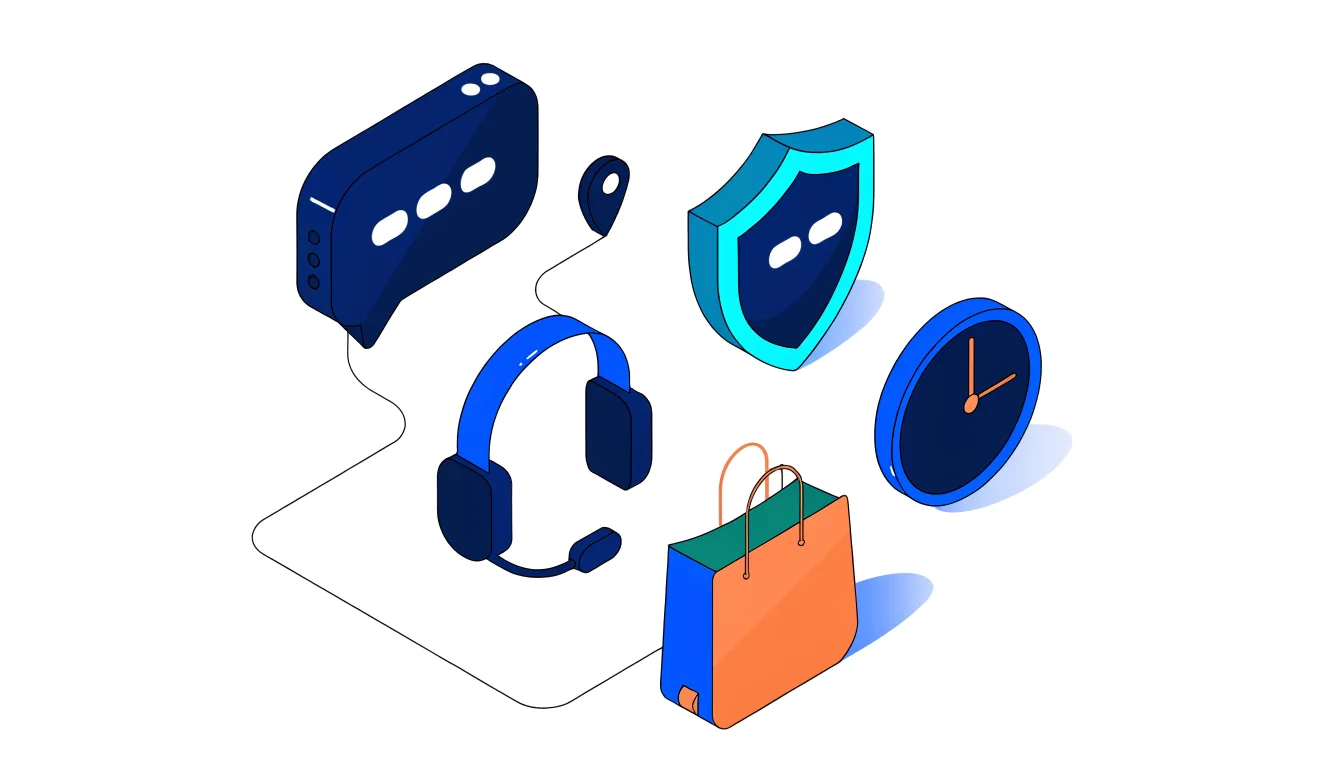
On most e-commerce sites, the Contact page is treated as a mandatory formality. But this page is actually the final trust check before a purchase. The user has liked the product, seen the price and shipping, and has just one lingering question — and their path leads here. If your Contact page feels like a "complaints corner you go to when something goes wrong," the user mentally disconnects from the purchase.
- Show that operations are live: business hours, a real phone number, a promise of a fast response… The message "there's a real team behind this" lowers the perceived risk and is especially decisive on a first-time purchase.
- Don't leave the user stranded there: reconnect them to the flow with links to frequently asked questions, products, or back to shopping.
- Give the "I can reach someone" feeling at first glance: users shouldn't have to scroll through the page to find contact information.
Don't Say "Easy Shopping" — Show What's Easy
The biggest trap in e-commerce copywriting is abstract promises. Phrases like "easy shopping" and "better experience" don't create any image in the user's mind, because everyone says the same thing. Real persuasion happens when benefits are broken down into specifics. Users want to see clarity like this:
- The shipping cost shown in the cart won't change at the last step.
- Payment is completed in two screens.
- You'll get a warning before stock runs out.
- A return request can be opened from a single panel.
The same logic applies to product descriptions. Instead of a list of technical specs, sentences that answer "who is this for, what problem does it solve, when does it come in handy" speed up the decision moment. Remember: users don't read descriptions — they scan them. Clarity at the top, details at the bottom.
The Most Dangerous Sentence: "I Wouldn't Click on That"
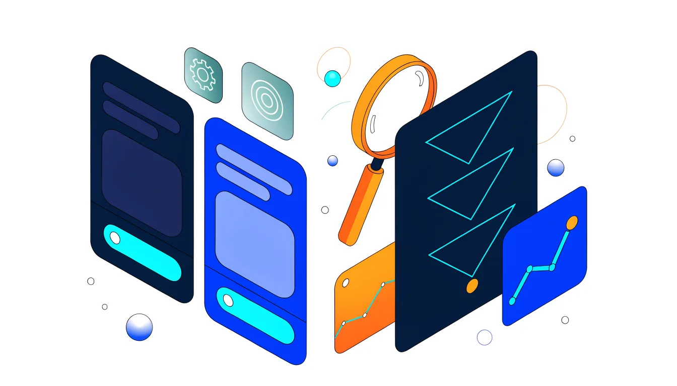
Most e-commerce decisions seem logical and safe: we simplify the design, soften the copy, set up campaigns based on our own shopping instincts. And that's exactly where we make the most expensive mistake — assuming that customers think like us. The decision in the cart doesn't pass through your aesthetic preferences; what users actually do is far more telling than how you feel about it.
- Test product listing order, campaign labels, colors, and countdown mechanics. If a variant you find visually weak is selling more, that's the winner.
- Campaigns that speak to everyone are safe but leave no impression. A brand that speaks clearly to a specific type of user gets a faster response. This means losing part of the incoming audience — but those who remain own the message and go to the cart more decisively. Sales growth most often comes from a narrower target.
Looking Through the Right Lens for Turkey
Global discussions are full of scenarios about "clicks declining, organic traffic dying." But in the Turkish market, this picture isn't playing out in the same way; search continues to operate largely through its classic structure, and organic traffic remains one of the channels closest to driving sales. While AI-driven new search experiences are interesting, the volume needed to meaningfully fuel e-commerce sales at scale is still on Google. For this reason, rushing into moves like "let's create separate pages for AI" risks weakening existing visibility.
There's also the measurement question. Rankings alone are not a meaningful success metric. The meaningful metrics remain the same: orders, revenue, and cart completion rate. That's where the real payoff of all this work shows up.
Calling Back the User Who Left: Cart Recovery
Even after all your improvements, not every cart gets completed on the first try. The user gets distracted, leaves to compare prices, or a phone call interrupts them on mobile. That's why cart recovery flows are among the fastest-returning steps to reduce abandonment — they win back users who were already interested, without bringing any new traffic to the site.
- Timing is decisive: the first reminder should go out 1–3 hours after abandonment, the second the next day, the third a few days later. Too soon is annoying; too late and you're forgotten.
- Choose the channel based on the user: email is the classic approach, but opt-in SMS and WhatsApp have far higher open rates. Use the approved channel you have — and use it well.
- Save the discount for last: the first message should contain only a reminder and trust signals (stock warning, easy returns); an incentive should only come into play if the user still hasn't returned. Otherwise, you're training customers to wait, and needlessly eroding your margins.
Automating this series instead of running it manually one by one saves time and ensures no cart slips through the cracks. A properly set-up recovery flow converts a noticeable share of abandoned carts into sales at most stores.
Conclusion
Growing in e-commerce doesn't always require more ads or deeper discounts. Most of the time, what you need is to stop losing users who already made it to the cart. Remove surprise costs, simplify the checkout flow, show trust signals in the right place, treat your contact page as a stage in the sales process — and most importantly, make decisions based on real user behavior rather than your own preferences. The sum of these seemingly small improvements creates a revenue impact at most sites that far outpaces simply increasing the ad budget.
Would you like to see clearly where your site is leaking on the path from cart to checkout? Get in touch with us for a free e-commerce analysis — we'll identify the steps where abandonment is happening and put together an actionable roadmap.